I’ve recently suggested in a tongue-in-cheek manner, but not really kidding about it, that our consumption culture may itself be a bubble. I called it a Superbubble, maintained by a no longer justified confidence in the future, encouraged by advertising, easy credit, and other features of the Me-Me-Me society. But has that bubble been pricked by the mortgage bubble’s pop—and the financial meltdown that followed? I thought I would look for some indicators. The data graphed here comes from the Bureau of Economic Analysis (link). If you want to keep me honest, follow menus until you locate Table 2.3.6.
The table offers data on consumption in chained 2005 dollars; inflation is thus removed. The major categories of consumption are then broken down further. The first chart looks at the big picture, total consumption and its three major parts:
The colored lines show actual dollars. The straight, thin, black lines are the trends of each curve. Trends in these series are, of course, dominated by the 1995-2005 decade, thus by results obtained before the Big One came. Thus it is interesting to see how close or how far away we are from the trend in last years of these series, thus from 2008 through 2010. On this graph the top line shows total consumption; the trend shows that we are underperforming it in recent years. Looking at the components that make up the total, we see that we fall below trend least in the non-durable goods category (where food, clothes, and gasoline reside); the gap widens a little more in durable goods (autos, refrigerators), and most in household services (here we have housing, health care, recreation, subscriptions, and the like).
One way to read this is that in the basic categories we hew close to trend, in discretionary categories we are easing off on our purchasing—thus changing the trend downward. Put another way, the more voluntary the purchase is, the more we have fallen behind the decade-plus trend formed by these data. Now let’s see how further disaggregation illustrates what we are seeing thus far. Let’s start with stuff we need on a more-or-less daily basis, the nondurables category.
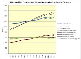
We fall beneath trend in every category. The gaps from least to largest are food, gasoline, and clothing. The biggest gap appears in the miscellaneous category, “other” nondurables; in tht category, possibly, our discretion is greater. We have to eat; we have to fill the car.
In this chart, tracing the shape of Durables, we see the most dynamism—and a surprisingly sharp growth curve. Notice that gaps between actual expenditures and trends are rather dramatically higher—especially in the largest category (until 2006)—automobiles and parts. A big gap exists in furniture and equipment; “equipment” here includes refrigerators, dryers, disposals, and such. The small gap in the “other” category, unfortunately, is not explainable—precisely because we have no data on what all that bin holds. The surprise comes when we look at recreational durable goods and vehicles. This category has not only displayed a fantastic growth in the period but it is also—never mind the Great Recession—right on track with its own head-spinning rise. When it comes to boats, dirt bikes, snowmobiles, and yachts—No is not an Answer!
The last graph of the day shows all kinds of household services. Recall that this category showed the greatest gap between actual and trend on our first chart. This graphic shows us the detail. Every category underperforms its trend. The lowest gap, again, is found in the category where discretion is least: in healthcare. The medical profession wants to use “health care consumer,” but consumer we are not; not in the sense of voluntary. Food services and accommodation are also largely on trend; that speaks to our habits; we are habituated to our Big Macs or our Burger Kings. Another low gap comes in recreational services. Recreation seems to trump any impulse to save our dough in honor of the Great Recession. The biggest gap appears in financial services. People have stopped or cut back on their investment activities. That’s not surprising. Housing and utilities—and that one is important because it is the largest category of expenditure—shows a deviation downward. So does “other” services—but we can’t easily discover what all that includes. I further note that people buy fewer airplane tickets, bus tickets, or both.
I wish we had data with better resolution. The question I have posed but cannot as yet answer is: Are people waking up, finally, scared to death by the mortgage melt-down and the evaporation of employment so that they will stay frugal? As in permanently? Or is this just the bottom of a Krazy-Ride-Rollercoaster and soon, to a collective sigh of relief, the little cart will start zooming to the sky again—only to come hurtling down once more? There is a paradox here, of course. We seem to require the Mad Consumption way of life to employ everyone. Unless we’re willing to kiss globalism by-be-bye and fall in love with tariffs again. As Market Size blog showed a day or so ago, the Paper Clip People have managed to get tariff protection. The Paper Clip People? Why not the rest of us?


No comments:
Post a Comment