Pages

Wednesday, March 27, 2013

One-and-a-Half Earths

I’d heard the phrase before—global footprint—but did not realize, until yesterday, that a quite massive statistical effort has been underway since 2003 actually to measure what, using other words, would be called the sustainability of modern culture or measuring the Earth’s carrying capacity. The institution is called Global Footprint Network (GFN), with headquarters in Oakland, CA and an office in Geneva, Switzerland (link).

GFN obtains statistical data from around 230 nations, of which 150 are routinely available; it collects more than 6,000 data points from each; using these data it produces an Input-Output table showing resources consumed and resources either returned for reuse to the ecology or accumulated as waste. The global footprint is the cumulated from country data. The footprint is expressed as global hectares (gha) available and equivalent global hectares used. A global hectare is defined as a biologically productive area of land or water; approximately 12 billion hectares were available to humanity in 2008. A hectare, by the way. is 0.45 of an acre, about the size of a soccer field. If human activity uses no more or less than 12 billion gha our activities are sustainable. If human activity is greater than that, we have what GFN calls overshoot. In 2008, the calculated equivalent usage was 18.2 billion gha, which GFN abbreviates by saying that we are using 1.52 planet Earth-worth of resources—one and a half earths. That, of course, is not sustainable.

According to GFN, our way of life became unsustainable around 1971. By 2050, assuming a moderate “business as usual” projection, we will be using the equivalent of 2-3/4 earths to support our civilization. Definitely unsustainable.

There is a great deal on the site worth studying. I found it especially interesting that GFN does not treat fossil fuel use in the conventional manner (“we’re running out.”) Instead it views fossil fuel use from the perspective of our ability to handle its wastes, thus the Earth’s capacity to absorb our carbon dioxide production.

The Global Footprint Network is, ultimately, looking at population pressure—thus falls under a tradition begun by Thomas Robert Malthus (1766-1834).  At the halfway point in Malthus’ life, circa 1800, world population was around 1 billion. We were then a long, long ways away form an unsustainable population. But we’ve increased population since then more than six times. And at some point somebody will be right. Unsustainablity will be reached. Does that mean that humanity will disappear? No. But the return to long-term sustainability will be neither pretty nor due to some clever gifts of technology, no matter how ingenious.

Monday, March 25, 2013

Why Can’t We Stop When We’re Ahead?

Occurs to me that humanity has not yet learned to stop when it’s ahead—and leave well enough alone. The occasion for this thought (it’s an old one) is the second failure of our expensive front-loading GE washing machine, Model WBVH6240FWW. In both cases the dial up front, intended to select the kind of wash you want to do, has failed to work.

Up to the time when we bought this machine, we’d owned other kinds that, when they failed, I could, to be sure with lots of study and effort, fix myself. But this GE machine is of the modern kind. It is much more consistently electronically controlled. Therefore failures such as these require replacement of entire structures. The defective part, containing valuable heavy metals and such, becomes a problematic waste—because teasing the traces of gold and other metals out of it is too expensive.

The very forces that produce innovation later produce excess of innovation: too many features, too much razz-ma-tazz. Briefly, and always only briefly, new features benefit producers. But very rapidly every maker has the same features. A simple-enough function, like washing clothes, become Boeing-like complex. We began our household with a simple washer-wringer machine—something like the one I’m showing (link)—which was itself a marvel of technology. It had a simple on-off button. It washed the clothes. The wringer squeezed them dry. Yes, we had to change the water and do some rinsing. It took a little attention—but habit filled in for the future electronics…

My point more broadly is that we could, theoretically, stop when we’ve produced a decent tool. But the madness of letting the Market do our thinking causes, in due time, perfectly useful products to disappear. Things are in the saddle?—something’s in the saddle. If this repair doesn’t do the job, our next washer will be a Maytag wringer washer. Looking around I see that I could get one for about $60-$100—much less than this repair will cost.

Monday, March 18, 2013

A Steady Drop in the Crude Birth Rate

In a post on Ghulf Genes a couple of days ago (link), in the context of “generations” named by popular culture, I showed a chart of the crude birth rate, thus births per 1,000 population for 1909 through 2008. In that post I wondered what the nineteenth century data might look like. Today I show a chart extending over 211 years, from 1800 through 2010.


The chart is rather instructive. The crude birth rate, which was 55 births per 1,000 people in 1800, has declined over two centuries to 13 birth per 1,000 in 2010, the lowest recorded in this time span. The rate was already dropping apace when the first reasonably effective birth-control devices were introduced in 1839, courtesy of Charles Goodyear. The “womb veil” mentioned on the graphic was the forerunner of the diaphragm. The second, call it technological, intervention came in 1960 when the FDA approved “the pill.” The third development was the legalization of abortion by the Supreme Court’s decision on Roe v. Wade in 1973—not that the public was waiting for that in the decades that came before. Technology and law aside, the phenomenon we’re seeing here is driven by cultural factors; technology and law are products of culture, not causes of demographic change.

If we fit a trend line to this curve, it becomes clear that the Baby Boom was simply a consequence of delayed opportunities for breeding, shown by the birth rate dip in the 1930s and 1940s. After the Boom, the long-term trend resumes.

Note that data for the nineteenth century are from census years only, obtained from Historical Statistics of the United States, published by the U.S. Bureau of the Census in 1975. I obtained the data from 1909 forward from a series, Vital and Health Statistics, published by the Centers for Disease Control and Prevention. This rate is called “crude” because it is a simple calculation; more refined birth rates, based on births by women in their childbearing years, the total fertility rate, requires much more careful calculation than simply dividing total population by total births.

The trend we see here underlies several “issues” that plague us, among them the aging population, the costs of maintaining such populations, and the immigration battles. Population growth in the United States is gradually having to rely on bringing population in, and, we hope, a population still willing to breed. And unless we have a growing population, we shall not have a growing market to consume the goods our machines produce.

To add more context—lest that great downward slide produces consternation—some comparisons. Of the 197 countries for which the World Bank provides data, 135 had a lower crude birth rate than the United States, 4 other countries matched our rate, and 57 had a higher rate, among them India (22). The top baby producer per 1,000 population was Niger (49). Those under-performing the U.S. included China, Russia, Japan, and all of Europe. The worst performer, with 8 per 1,000 was Germany.

The United States had a total fertility rate (TFR) of 2.1 children born to women in their child-bearing years in 2010. A TFR of 2.1 is equal the so-called replacement rate. This means that such a rate will replace all deaths in a given year. Our population, at present, is only growing by immigration. 116 counties in the world (of 197) had a higher rate, among them India (2.625), 80 had a lower rate, meaning that they were not replacing their population. Among them, again, are China, Japan, Russia, and all of Europe. The highest rate in 2010 was measured in Niger (7.06), the lowest in Macau (1.09).

Thursday, March 14, 2013

Maps of Catholicism Worldwide

No, I’m not showing any maps—but I am pointing to them. Here is the first link. It is one provided by the National Geographic and entitled “Map: The Roman Catholic Diaspora.” I suggest looking at the three maps there before reading on, one each for 1900, 1970, and 2010. A tab to the left and under the map lets you go forward and backward in time.

It is fascinating to see how the demographic center-point of Catholicism has shifted between 1900 and 2010. In 1900 Europe represented 67 percent of the global Catholic population; in 2010 it had declined to less than 24 percent. As Europe’s share declined, that of Africa and Latin America rose, so that in 2010 Latin America represented 41 percent of all Catholics, the new center-point of Catholicism. The Conclave of Cardinals this year for the first time reflected the facts on the ground and elevated a Latin American Archbishop to the Papacy. With a lag, always, demography rules.

Another view of this situation is provided by a map taken from the 2003 Encyclopedia Britannica by Mapsorama.com (link). It shows countries colored by the predominant religion in each—together with a chart suggesting increase world-wide of selected faiths by 2050 as projected by World Christian Trends. What this map shows is the diversity of the world of faith—but it also gives the nod to the Conclave, which gave the nod to Pope Francis.

Sunday, March 10, 2013

Hungry Children

A new documentary titled A Place at the Table, starring Jeff Bridges, opened March 1 and is now causing reverberations in the media. It is about people who go hungry. Where? In India? In Bangladesh? No. Here in America. All right. A scattered few? No again. Millions of them. The euphemistic phrasing that has developed around this subject over the years is “food-security.” It startled me to discover that the U.S. Department of agriculture has been tracking this status for what seems to be years. The most recent data (from the Statistical Abstract: 2011, Table 210) that 17.1 million of 117.6 million households were food-insecure in 2008. Those food-insecure are further classified as having “low” and also “very low” food security. Some 6.7 million households in 2008 fell into that second category. Staying with 2008 for a moment longer, in that year, according to the USDA, of 74.1 million children in the United States, 16.7 million lived in food-insecure households, 1.1 million in the most insecure.

One more statistic. In the 2004-2008 period, households grew annually at 1.0 percent a year. Households that fall into the food-insecure category grew at a rate 6.2 percent a year. Mind boggling!  And this in a country that thinks itself—and indeed really is—the richest country in the world.

Hunger is the consequence of poverty. So let’s look at children living in poverty over a more extended period of time and closer to the current year. We have data that reach from 1999 to 2011. Here is a graphic:


What I show here is an index based on the percentage of children living in poverty officially and in households at or below 200 percent of poverty. To illustrate this last category: In 2012 the official poverty rate for a family of four was an income of $23,283 or lower a year; 200 percent of poverty means an income, for such a family, of $46,566 or lower. The 200-percent category, therefore, also includes those in poverty.

The graph I show is an index based on three-year averages. Results for the 1999-2001 period are set at 100, and all following years show divergences from that level. Notice that children who fall into the 200-percent category have increased significantly more than those in poverty using this index. Corresponding actual numbers: In the beginning (1999-01), 15.9 percent of all children were in poverty, 38.1 percent of those in the 200-percent category. In the last period (2009-11), children in hard core poverty represented 21.5 percent of all children, those in the 200-percent category 43.1 percent.

Can I say anything positive about this? Well, there are charities that strain to their utmost to feed the hungry—and having ever greater difficulties doing so as our national wealth is frittered away feeding the 1 percent and on useless wars all over the place. These charities deserve a major raise—which is up to us. The collective seems to be failing. We must act as individuals.
————————
Data for children at or below 200 percent of poverty: link. Data for children in poverty: link.

Saturday, March 9, 2013

Job Gain/Loss by Sector, February 2013

Herewith a look at the February 2013 employment gains by sector—from the same Bureau of Labor Statistics press release referenced yesterday.


Red bars are almost absent—meaning that only two sectors had job losses in the January to February interval. If we group them, the best performing sectors, with a gain of 160,000 jobs, were in the services sector, and within that grouping Professional and Business Services were doing best of all. Sectors engaged in physical production  (Mining, Construction, and Manufacturing) came second, with a gain of 67,000 jobs. The trade sectors (Wholesale, Retail, Transport and Warehousing), came third (28,300 jobs added). Government experienced a 10,000 job loss—something that has been pretty routine over the past two years or so.

The pattern, except for shrinking government employment, is encouraging.

Friday, March 8, 2013

Employment Update: February 2013

The data on employment released today by the Bureau of Labor Statistics (link) should cheer the public. The economy created 236,000 jobs in February. To be sure,  December numbers were revised upward by 23,000, January numbers downward by 15,000, so the net gain in February was 244,000. The last time we’ve had an uptick of the same magnitude was last November. Good news.


The month-by-month chart shows January’s revised results (pale blue) and the February results in red. January and February 2012 results were higher, but employment generation then declined in subsequent months. How will it be this year? To be seen.


This second chart, which shows annual results from 2007 through 2012 and annualized results from 2013, thus far, indicates that, as of February, we are still underperforming 2012. 

So how much of the 8.6 million jobs lost in the Great Recession (2008-2009) have we recovered thus far? Here is the pie chart:


We’re still struggling to reach the two-thirds number. Tomorrow we’ll take a look at gainers/losers by sector.

Thursday, March 7, 2013

Maintaining Useful Skills

One of my favorite retail outlets is Joan Fabrics. The franchise sells all kinds of textiles, of course, but also a quite wide range of tooling for sewing, quilting, knitting, jewelry-making, and on. Being a male I’ve not been trained in any of these crafts, but it gives me enormous pleasure when visiting the store, usually with Brigitte but also occasionally on my own to buy gifts, to see how many women are in the store, to see how knowledgeable they are. They are maintaining useful skills. Quite a few of them are young—suggesting that the skill is being passed from one to the next generation.

Readers of this blog know by now that I expect industrial civilization to pass within, say, about eighty years. Fossil fuels will run out. I’m also (as who isn’t, deep down?) committed to the continuing welfare of society; disorders are coming; we should be prepared for that. And one way of doing so is by maintaining skills useful when the machines all die away.

To be sure, right here and now, we can’t all turn into farmers, weavers, tailors, carpenters, smiths, charcoal burners, lumberjacks, paper-makers, hand printers, calligraphers, cabinet-makers, shoemakers, clockmakers, food canners, well-diggers, and masons—all able to do these things without electrical energy, oil and gas, fancy chemicals, and steel or plastic tools. But we can be, indeed we should be, cultivating useful skills of the old-fashioned sort as hobbies. That will maintain a skill-base when, as we used to say in the Army, the balloon goes up.

Many who cultivate hobbies do so, indeed, by buying very expensive modern equipment. That is a start, of course. Learning how to use a fancy saw or a good sewing machine is one way to come in touch with wood or fabric. But more power to those who go beyond machines and begin to take an interest in how people did things in, say, Civil War days. Limited sources of energy and basic industries—like iron and steel, cement, and weaving—were present then and will be again as we gradually abandon our vast dependence on cheap energy. And the wider the skill set, the more teachers there will be to whom the young can be apprenticed as the New Age dawns.

Wednesday, March 6, 2013

The Dow is Not the Economy

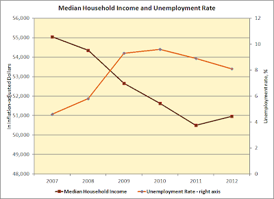
The Dow Jones Industrial Average reached and then slightly exceeded a top level reached in 2007:

October 9, 2007
14,164.53
March 5, 2013
14,253.77

This caused something of a hoopla in last night’s news coverage and in the headlines this morning. One reason for this is that the Dow Jones, the Nasdaq, and the S&P 500—all of which sum up the stock markets minute-to-minute during work days are the only ever really current statistical indicators. Therefore, certainly in the media, they are taken for an indicator of the Economy. But, of course, the Dow is not the economy. Not really. The speculative reactions of market traders to news of one sort or another, their “sense” or “smell” of what is happening—not in the real economy, where people live, but to the valuations of corporations, most of which are operating world-wide, are not really a measurement that indicates genuine values achieved—except to those who get all of their income from gambling on the market.


Above two real indicators. I’m showing median household income as one, the unemployment rate as another. Both are shown for the 2007 through 2012 period. Median means the household income at the very middle of the distribution. Thus half earn less, half earn more. In 2011, using Census data, the median income was $50,505. The Average household income, which reflects the huge incomes of the top 1 percent, is much higher. In 2011 it was $76,062.

These two indicators show that we are quite a long distance still, five years later, from the performance of the real economy in 2007. In that year the median was $55,039, the unemployment rate at 4.6 percent. In 2012 the corresponding values were $50,964 and 8.1 percent.

Listening to the coverage on Public Television last night, I heard again mentioned that there are two economies. The Dow reports on one, the economy of concentrated wealth. The household income and unemployment data report on the economy of ordinary people. One of the oddities of the laisser faire free market is that, without massive and energetic government intervention, it will trend toward monopoly power. Eventually, of course, when the population is impoverished, it wipes itself out.

Tuesday, March 5, 2013

China and Real Estate

Both the Wall Street Journal and the New York Times this morning noted moves by the Chinese  Government to puncture that country’s real estate bubble. The moves, which include a 20 percent capital gains tax on real estate sold, had immediate (if perhaps only temporary) effects on property prices and the stock market, particularly the stocks of developers. China is also planning to make it more costly for people to buy second homes. Wider efforts, reported by the WSJ, aim at shifting growth from exports to internal consumption, which would require raising household incomes.

Perhaps it is already too late for China, but for the moment the center there still holds—meaning that government can act rapidly and decisively to protect the welfare of most of the population. I qualify this by using the word “perhaps” because the dissolving acids of the “free market” may already have penetrated the top communist elite enough for things to end badly. A while back I read a novel by a Chinese writer set in modern Shanghai; the book strongly suggested that a Commie-Capitalist Complex (as in the sense of a Military-Industrial Complex here) is already on the verge of grasping power. If so, look out.

The longer-term historical patterns in China suggest, however, a cycling between “virtuous” authoritarianism, the decay of the ruling element, the outbreak of civil war—the winner of which, under the Mandate of Heaven, once more takes charge and rules virtuously. Virtuous rule means that the government holds down the very forces that the free market releases. Another way to put this is that China is habituated to authoritarian rule over millennia. When that weakens, somebody is on the take. We shall see. What comes next? Another cultural revolution? Or will the twenty-first be the Chinese Century. If so, I feel for the ordinary Chinese. They will be ever more affluent but less and less content. And slouching toward China, as toward all other countries too, is the Rough Beast of the Post-Fossil Age. When it arrives, a cultural revolution in China is a dead certainty.

Sunday, March 3, 2013

Acres Needed to Support a Family

Looking to the future, and a time when we will have to support ourselves, again, largely by agriculture-without-oil, I thought I’d look into this subject. Let me start with some U.S. Department of Agriculture data (link, see tables at the bottom of that page). These show historical farm acreage under cultivation. From these I’ve calculated “big picture” averages, thus how many acres supported a person in the past, do so now, and that number, multiplied by 4, provides some idea of what a family needs for support. Here is the tabulation:

Farm acreage per person and family of four
Farm
U.S.
Acres
Acres
Land
Population
per
per
Year
(000 acres)
(million)
person
4 People
1850
293,561
23.2
12.7
50.6
1860
407,213
31.4
13.0
51.8
1870
407,735
39.8
10.2
41.0
1880
536,082
50.2
10.7
42.7
1890
623,219
62.9
9.9
39.6
1900
838,592
75.2
11.1
44.6
1910
878,798
92.2
9.5
38.1
1920
955,884
106.0
9.0
36.1
1930
986,771
122.8
8.0
32.1
1940
1,060,852
132.2
8.0
32.1
2010
918,840
308.7
3.0
11.9

An interesting table. Notice that, with a population nearly three times greater than we had in 1920, we used fewer acres of farmland in 2010. Note that the number of acres needed to support a person declines as time passes, from a max of 13 in 1860 to a mere 3 acres in 2010. Similarly the acreage to support a family has shrunk by more than a factor of four between 1850 and 2010. What explains this? Fossil fuels—for doing the mechanical work, for increasing fertility, for controlling pests, for freezing, processing, and transportation.

In turn, the disappearance of such fuels means that, out in time, the need for acreage will either greatly increase or the population will have to shrink. Supposing that we needed 10.2 acres per person in 2010 (as we did in 1870). In that case we would’ve needed 3.1 billion acres under cultivation to support the population—nearly three times the maximum acreage (1.1 billion) we’ve ever cultivated in the United States (in 1940). Pondering that requirement will produce some interesting future scenarios. For starters, our current farm acreage includes some significant portion which requires fossil fuels to pump water to make it useful; such acreage will first fall away. How much naturally arable, rain-watered land do we have? I don’t know, but I’ll post something on that in the future.

Now for another kind of take on the subject, this time working from the bottom up, asking ourselves how many calories we need and what amount of acreage we might need to produce it. Here I’ve found a splendid article written by Nathan Lewis and published on a site called 24hgold.com (link). The article is long but well worth reading carefully if your thoughts are on the longer-term future. Lewis concludes that a family will need minimally 17 acres to sustain itself, operating organically, including having a horse. Now that just feeds the family. The farm does not, as yet, sell much of its product to others—just enough to buy the extras needed for survival. Interestingly, if the family had an 1850-level 50 acres, it would also be able to provide for two other families living in town and, say, sew clothes or shoe horses.

Difficulties loom ahead here, but this transition we will have to accomplish—and do it right. It will take all of our ingenuity, hard work, and dedication to get there—compared with which the making of a new hot version of a smart-phone will seem like the mere buzzing of a fly.

Saturday, March 2, 2013

Think Globally, Act Locally

Yesterday’s post is an example of thinking globally—about the big picture, the big time frame. The “global” also represents a dimension effectively out of tangible personal reach. We participate in the formation of the great collective future, but any one person’s action is, from the global perspective of nearly 7 billion people, virtually invisible. Therefore global thinking has its counterpart in local action.

The paradox hidden in this pairing, however, is that, ultimately, the only way to shape the future is by local action. Supposing that, locally, the only place where action is possible, all of us began, to quote from Monique’s comments on my “Apocalypse,” to be “kind, cheerful, trustworthy, generous, and true.” What would be the consequence? Positive change would be the consequence—although it would take a while. My guess is that certainly a year would pass before we saw something—because people would be so utterly astonished, they would be shaking their heads in wonderment for at last several months.

But joking aside, the truth is that all of us live at the local level. The global just mirrors back the quality of our thoughts, attitudes, understanding, and the actions that flow from them multiplied…7 billion times… and then spreads out again until a tiny portion of it reaches us again, locally.

Thinking globally does not produce cheer—but it does produce a realistic attitude. It helps us identify regions of weakness and of strength in the environment, physical and social. And keeping those in mind in how we act and what we choose to do, will eventually, as we act correctly, compensate for ills and realize the visible opportunities. Realism is a genuine benefit of global thinking—provided that we act on it where we happen to be and in doing what we happen to be doing.

A prevailing view at present—and it is one of the weaknesses of our time—is the belief that collective action is the only meaningful one. Therefore the continuous drumbeat of persuasion—trying to make other people act so that we get what we want. Another weakness of our era is its belief in relativity. Kindness, cheer, trust, generosity, and truth are anchored in something absolute, also present only in the individual. Actualizing these in action, which is by definition local, produces change for the better. It will not produce Utopia, but it carries its own reward, even when things are trending downward. When right action is pursued, it raises us, as individuals, above the fog of war.

Friday, March 1, 2013

Reform, Change, Apocalypse

If we apply these three words to the future, what is almost certain is that, if we write these words with a leading cap, we will not see much if any Reform. Genuine reform, of the sort that really takes hold, requires a very strong and enduring leadership, a Napoleon, the kind of figure who (as I will soon unpack) follows an Apocalypse. It requires, also, a vast public consensus, not a radically polarized one. Therefore no leading-cap Reform. What is certain is that we shall see Change. Now as for that last term in my title, let me first give it some definition.

An important aspect of that concept, Apocalypse (certainly in the modern mind) is a cataclysmic event. And cataclysm comes from the Greek for “deluge, flood, inundation,” literally a “down-wash.” The meaning therefore is something that takes place suddenly, an event, as contrasted to change or to reform, both of which are more associated with a process. The time scale of each of these concepts if important. Those who are “sick and tired” of the current day do not react with pleasure when told that, in due time, this too shall pass. They want Apocalypse Now. They want upheaval. They want Revolution! Quickly! They want to see things in the easily encompassed near-term, therefore no more than a decade away—and even giving it a decade is distasteful.

Given this definition of Apocalypse, it is highly unlikely in the expanded now, thus within fifty years. It requires a rapid and very traumatic build-up of troubles, touching very large populations. When it comes, it is an eruption; and things are not decaying fast enough. What we shall get is Change, a word that is neutral, as such, but if I exclude the likelihood of Reform, it means Change-for-the-Worse; but it will not be massive or rapid enough to ignite a Revolution. That is, of course, the worst sort of future, but the most predictable when a vastly successful civilization begins its slide into disorder.

In our own case, which is tied to Western Civilization but has global reach—witness China caught now, like the rest of the world, in the quicksands of capitalism—there is, you might say, Apocalypse at the end of tunnel. The Change will proceed and things will get worse and worse, but the real anguish will arise closer to the end of the twenty-first century than before—when oil and gas finally run out. Their running out may come sooner than 2081 for oil or 2073 for gas (see link) if, in the run-up to that projection, which is based on “things as usual,” oil-wars begin to erupt all over the world and speed up both the consumption of it and the wealth of ordinary people to finance the conflicts.  Then, when the anguish really sets it, we may get Apocalypse. And some decades after it has run its course, at last will come Reform.

“That’s not good enough!” the angry critic of this dispensation will cry with balled fists. Sorry about that. We dispense genuine projections around here, not feel-good in the next quarter.